
Introduction
Visa processes billions of dollars in settlement payments every day. For years, treasury teams relied on VFTS (Visa Funds Transfer System), a text-heavy mainframe tool designed decades ago. Despite its importance, VFTS was complex, outdated, and inefficient.
Payment Hub was created as Visa’s next-generation treasury platform, consolidating fragmented workflows into one streamlined system.

Legacy VFTS vs. Payment Hub: A transformation from text-based, manual processes to a modern, intuitive digital platform.
As Staff Designer, I:
Drove platform-wide UX, shaping the information architecture and flows across all modules.
Created all UI designs, translating research insights into intuitive screens.
Partnered with researchers and conducted user interviews, uncovering pain points and mapping journeys.
Aligned stakeholders across product, engineering, and treasury, ensuring usability balanced with business and regulatory needs.
Grounding in Reality
To design a system grounded in users’ reality, I first studied the tools treasury analysts used daily to manage billions in payments:
VFTS mainframe for wire processing.
Bank portals for executing and verifying transactions.
Excel spreadsheets for reconciliation and forecasting.
PDF reports for tolerance checks and approvals.
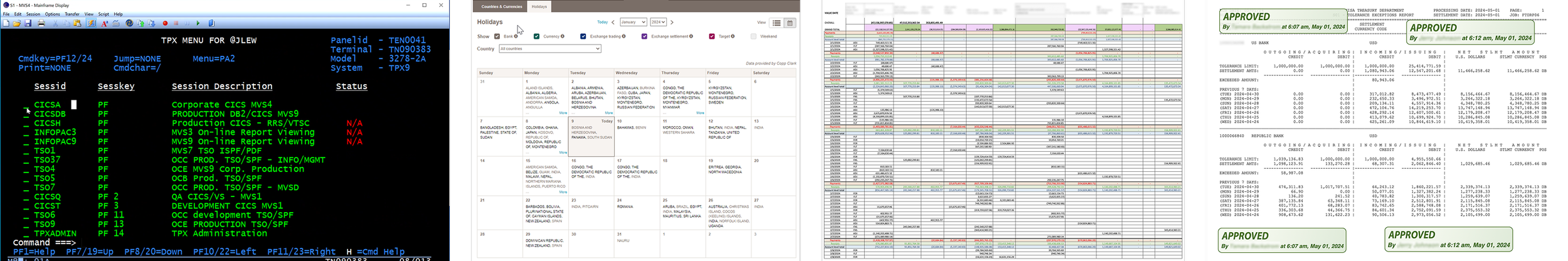
Treasury analysts’ daily tools — VFTS, bank portals, Excel, and PDF reports — essential for operations but fragmented, forcing constant switching and manual effort.
Analysts often had to switch between all four systems in a single workflow — reconciling numbers in Excel, validating breaches in PDFs, logging into VFTS to approve wires one by one, and confirming settlements in bank portals.
This fragmented ecosystem created delays, unnecessary manual effort, and high risk in billion-dollar settlements. These insights became the foundation for mapping user journeys and identifying opportunities to streamline through Payment Hub.
Research & User Interviews
Working with our UX researcher, I conducted interviews and contextual inquiries with treasury analysts. These sessions revealed deeper frustrations:
Painful daily logins with repetitive security hurdles.
One-by-one wire approvals, making high volumes slow to process.
Reliance on email handoffs for exceptions and escalations.
Inconsistent workflows across teams and regions.
Stress and error risk when reconciling billions manually.
I synthesized these insights into user journey maps for both the Funds Transfer and Cash Ops teams. The maps highlighted recurring pain points and became the foundation for aligning stakeholders on what needed to change.

Funds Transfer Team – Hours spent retrieving reports, logging into VFTS with OCR codes, and releasing wires one by one.
Cash Operations & Investment Team – Juggling balances, trades, and urgent requests across fragmented systems, scanned forms, and endless email threads.
Tackling Approve & Release — the Biggest Pain Point
“Approving wires one at a time feels endless.”
The Approve & Release step emerged as the single biggest bottleneck during research. Treasury analysts had to:
Log into VFTS with a tedious OCR/firewall code every day.
Approve and release wires one by one, even when hundreds needed processing.
Communicate held wires manually, adding delays and errors.
Users described this process as “endless” and “painful,” consuming hours each day.
My Design Response
I redesigned this step around efficiency and bulk actions:
Bulk approvals: Analysts could review and approve multiple wires at once instead of one by one.
Streamlined login: Authentication hurdles were reduced by moving approvals into Payment Hub, eliminating daily OCR codes.
Integrated exception handling: Exceptions and held wires appeared in the same view as approvals, so analysts could act without switching systems.
Clear status visibility: At-a-glance indicators (pending, held, rejected) replaced manual email communication.

From one-by-one approvals in VFTS to streamlined bulk approvals with integrated exception handling in Payment Hub.
Impact
These changes were projected to save analysts several hours per day, reduce fatigue from repetitive tasks, and minimize the risk of delays in billion-dollar settlements.
Defining the System
Beyond fixing one bottleneck, I designed Payment Hub as a platform-wide solution. I created a sitemap that aligned product, engineering, and treasury leadership on a modular structure: Dashboard, Payment Release, Manual Payments, Holiday Calendar, Cash Netting, Reports, Configuration, and Alerts.
Sitemap — establishing a shared vision of the platform’s modules and information architecture.
Final Design

Dashboard
Clarity with at-a-glance dashboards — users see today’s tasks, cash flow, and exposure in one view instead of toggling between systems.

Payment Release
Efficiency through bulk approvals — wires can be approved, released, or flagged in groups, reducing hours of repetitive work.
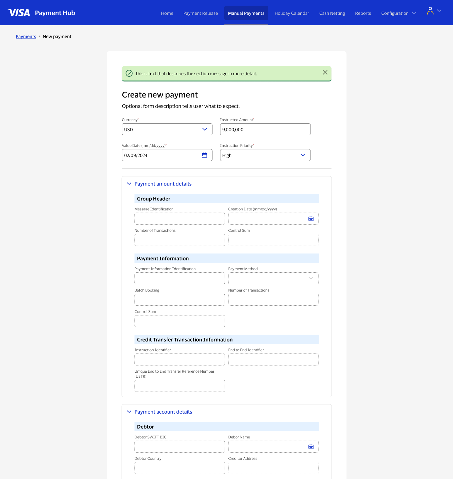
Manual Payments
Flexibility for exceptions — one-off wires can be created quickly with pre-filled details, reducing error risk in urgent cases.

Holiday Calendar
Control through centralized calendars — manual approvals for global holidays are consolidated into one view, eliminating fragmented checks.

Cash Netting
Accuracy through automation — multiple bank accounts and currencies are netted automatically, replacing manual reconciliation in Excel.

Alerts & Notifications
Proactive risk management — configurable alerts surface exceptions before they escalate, reducing billion-dollar error exposure.
Outcomes & Impact
My designs provided:
Strategic clarity – a modular platform vision that leadership adopted for long-term treasury modernization.
Operational efficiency – automation and bulk actions projected to save analysts hours daily.
Risk reduction – validation and alerts minimizing billion-dollar errors.
Organizational alignment – a unified design system that balanced usability, technical feasibility, and compliance.
Treasury analysts praised the designs for removing long-standing frustrations, and leadership recognized Payment Hub as a foundation for future growth.
Reflection
Designing Payment Hub wasn’t about polishing screens — it was about simplifying complexity at scale.
This project reinforced my ability to:
Lead with research, turning interviews into actionable journey maps.
Translate ambiguity into clarity, moving from fragmented tools to a unified system.
Drive alignment, ensuring product, engineering, and treasury rallied around one vision.
Design for scale, creating a platform that supports Visa’s global treasury operations.